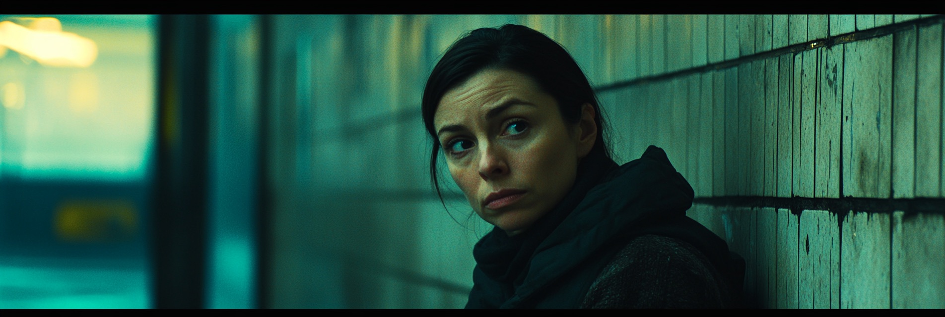
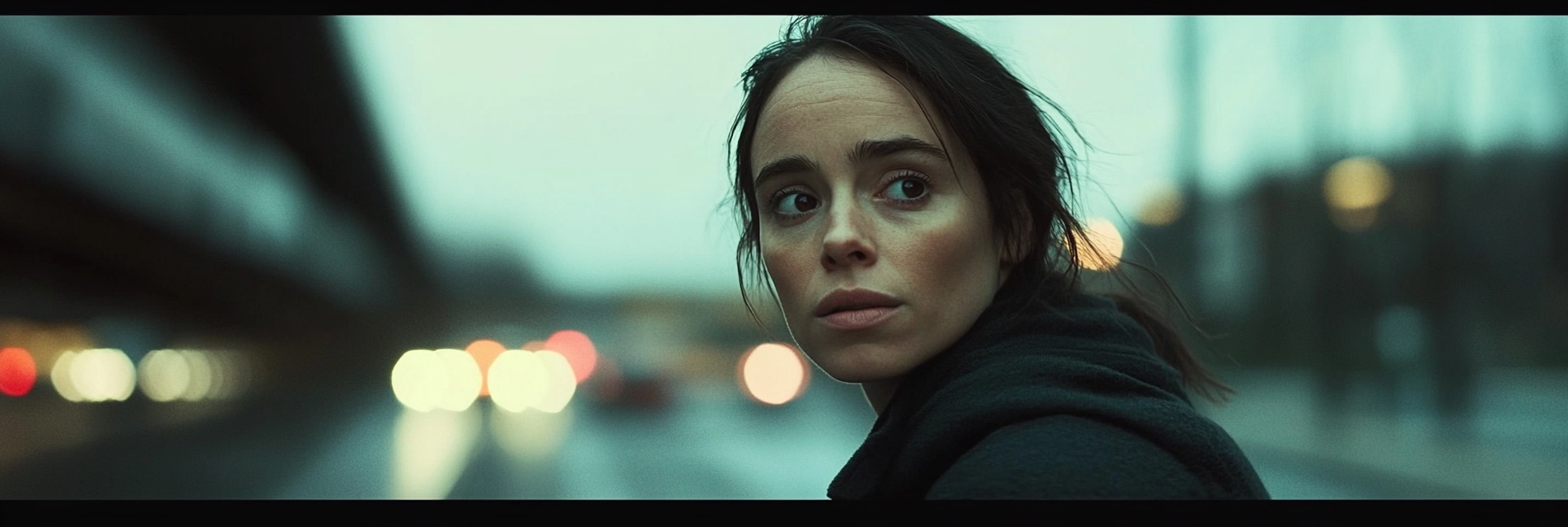
Color Grading is more than a simple post-production adjustment—it’s a powerful storytelling tool that profoundly shapes a film’s mood, emotion, and overall atmosphere. From subtle tonal tweaks to sweeping stylistic transformations, this process turns raw footage into cohesive, visually striking cinema.
Color Grading refers to the deliberate manipulation of colors in a film or video to achieve a specific artistic or thematic goal. While color correction focuses on fixing exposure or white balance issues, grading digs deeper, sculpting color palettes that evoke particular emotions or reflect a distinct visual style. Whether adding warm, golden hues for a nostalgic feel or desaturating an image for gritty realism, color grading weaves subtle cues that guide audience perception.
Effective Color Grading underpins visual storytelling. Filmmakers harness it to highlight narrative turns, enhance character emotions, and unify scenes shot under varied conditions. Even a minor tweak in color temperature can shift a scene from hopeful to ominous, illustrating how powerful these nuanced adjustments can be.
Additionally, grading aligns distinct filming locations—outdoor scenes, studio sets, or different times of day—into a single, coherent vision. By matching lighting and color tone, audiences remain immersed in the story rather than distracted by abrupt visual changes.

Contrast governs the difference between the darkest shadows and brightest highlights. A high-contrast look heightens drama, while a low-contrast aesthetic conveys softness or subtlety. Balancing tonal range ensures clarity in both dark and bright areas, preserving detail and guiding the viewer’s eye.
Achieving correct Color Balance requires adjusting red, green, and blue (RGB) channels to produce a neutral white, especially in skin tones. From there, colorists can introduce stylistic biases—like adding a bluish undertone to evoke melancholy or a warmer cast for an inviting ambiance.
Hue is the shade of a particular color (e.g., red vs. green), while Saturation determines color intensity. Desaturated imagery emphasizes realism or a somber mood, whereas bold, saturated colors can create a vibrant, fantasy-like world. Deciding how “colorful” or muted a scene should be is key to supporting the film’s genre and emotional tone.
Balancing exposure ensures no crucial details are lost to pure black (underexposure) or pure white (overexposure). Subtle underexposure can heighten suspense in a thriller, while brighter scenes often complement comedies or family-friendly features.
Beyond global adjustments, Secondary Color Correction targets specific areas or hues. Tools like power windows, masks, and HSL (hue, saturation, luminance) curves let colorists alter skin tones, skies, or set pieces without affecting the rest of the frame. This precision shapes each element of the scene to align with the overarching style.
 Ingest and Organize: Import your footage into your editing or grading software (e.g., DaVinci Resolve, Adobe Premiere Pro, Final Cut Pro). Label or group clips by scene and lighting condition.
Modern Color Grading relies on multiple color spaces and specialized software, each serving unique workflows:
Color Grading often varies depending on the film’s genre:

Most projects benefit from at least basic Color Grading to unify varied footage and reinforce the intended mood. However, the level of grading depends on creative goals and production constraints.
Color grading can greatly improve footage but has limits. Severely underexposed or overexposed clips lose essential detail, making it challenging to salvage them perfectly. Proper on-set lighting and exposure remain critical for high-quality results.
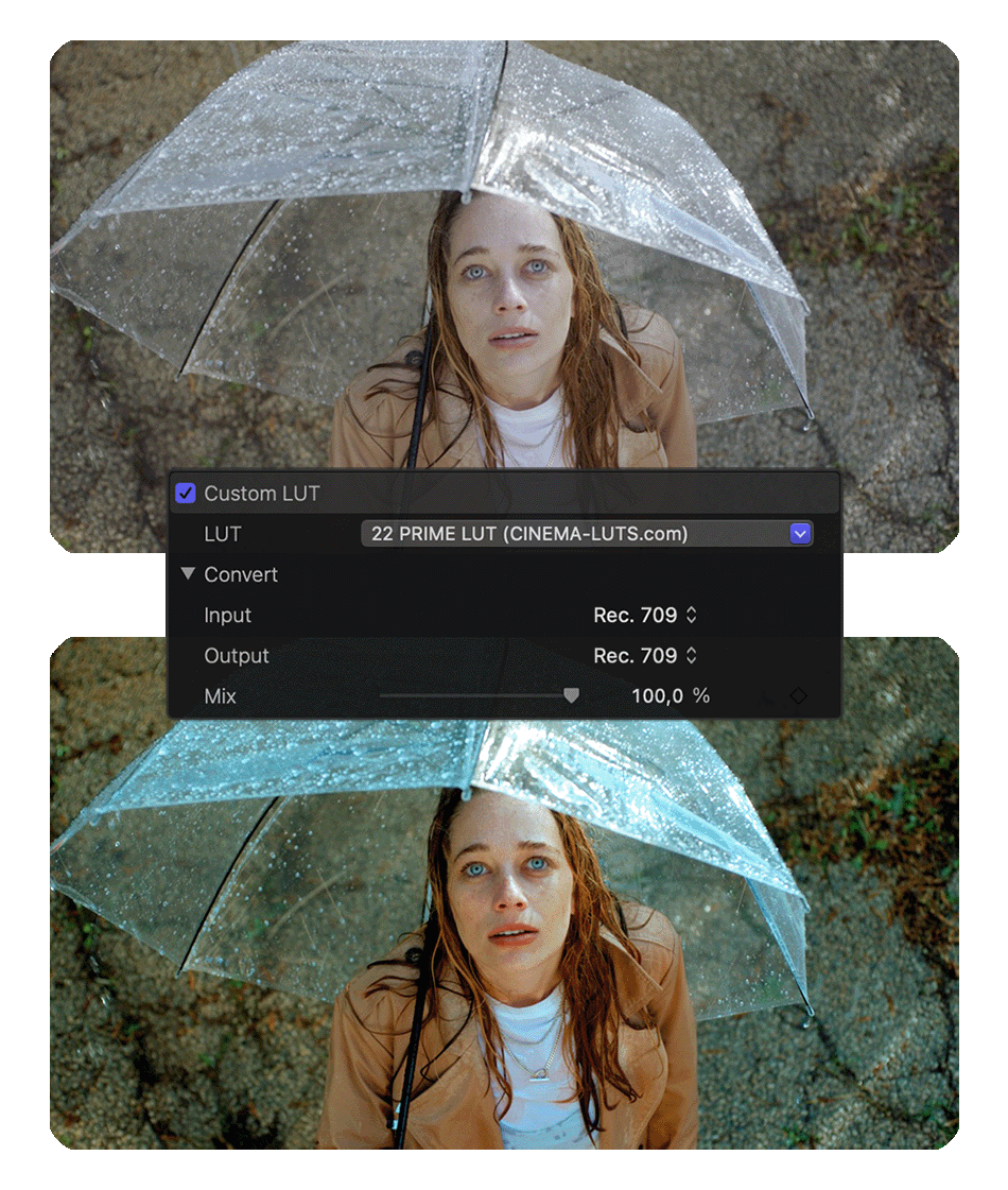
LUTs (Lookup Tables) apply predefined color transformations to footage. They can quickly deliver a specific look or serve as a starting point for detailed grading. Many filmmakers develop custom LUTs for consistency across multiple projects.
Absolutely. A calibrated monitor ensures that colors and brightness levels are accurate, preventing surprises when your work is viewed on different screens or projected in theaters.
Programs like DaVinci Resolve (including the free version) or Adobe Premiere Pro are excellent for newcomers. They provide robust tools with a manageable learning curve, supported by countless online tutorials.
Color Grading is a transformative art that can elevate your film from ordinary to extraordinary. By balancing technical precision with a keen artistic eye, colorists and filmmakers shape emotional landscapes that resonate with audiences long after the credits roll. From adjusting exposure and contrast to fine-tuning hues for character arcs or thematic depth, every step in the grading process builds a more compelling, immersive visual narrative.
Whether you're aiming for Hollywood-level polish or crafting an indie passion project, understanding and applying Color Grading best practices is critical to professional-quality results. Dive into the world of color theory, experiment with different software and LUTs, and refine your technique over time—each scene and shot can become a masterpiece of cinematic storytelling.

CINEMA LUTS PRO+
Turn your footage into cinematic masterpieces with our 1-Click solution LUTs. Over 30 handcrafted presets are waiting for you!
© cinema-luts.com
Imprint - Privacy Policy - Cookies - EAA - Blog